Features / Traffic, transit and businesses
Traffic, transit and the businesses already there
What passes the site, when the area is busy, how residents reach it without a car, which businesses are listed around it, what has appeared and dropped out of the listings, and whether the counties around it are gaining or losing people.
Traffic
See how much traffic passes the site
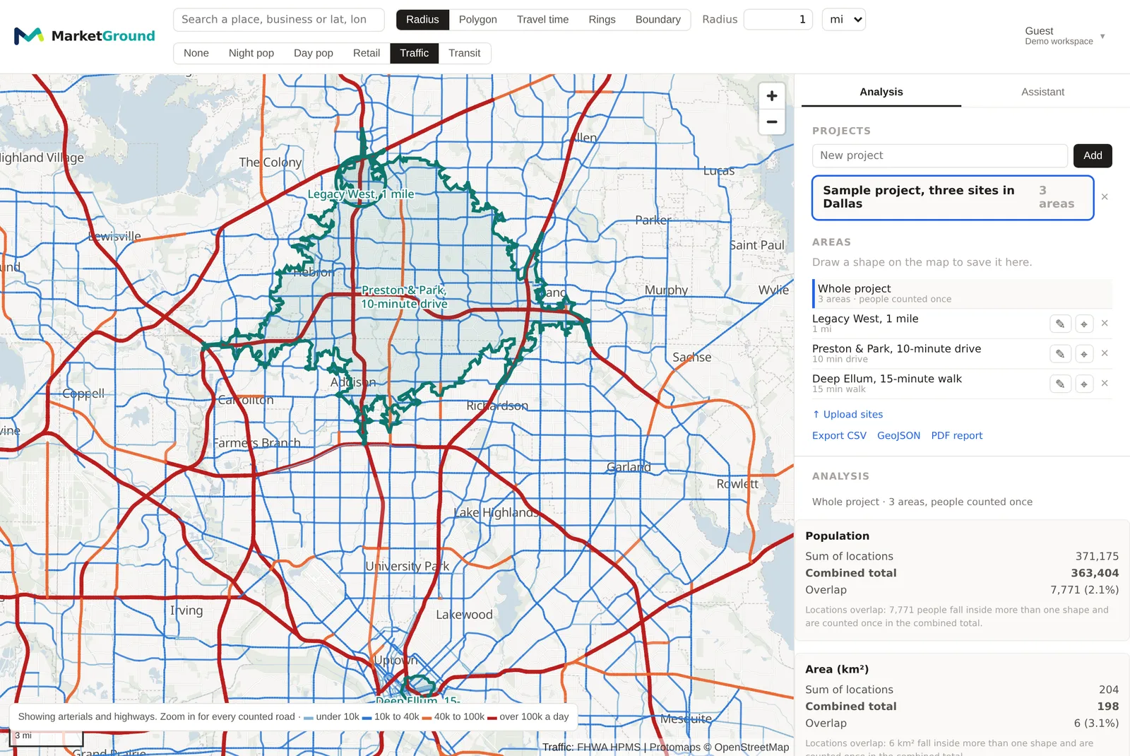
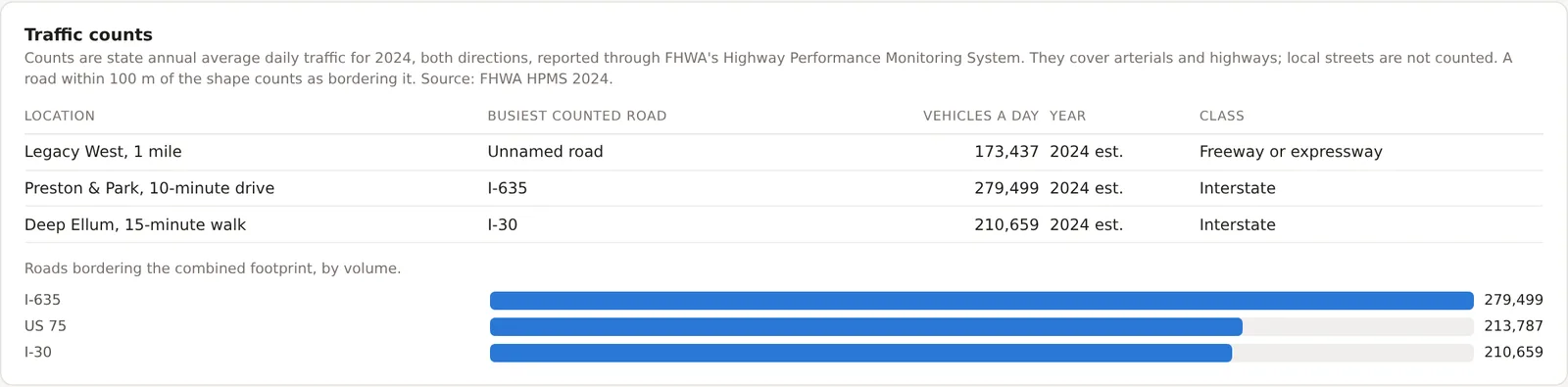
Every area names the counted roads that border it, with the vehicles a day each one carries and the year the count was taken. The figures are annual average daily traffic, reported by state departments of transportation through the Federal Highway Administration, and they cover arterials and highways rather than local streets. Where no counted road borders an area, MarketGround names the nearest one and says how far away it is. Turn on the Traffic layer to read the road network before you draw. Included on Pro and Team.
Through the week
Read the road hour by hour
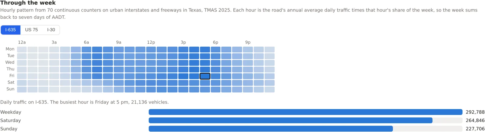
Each counted road's annual average is spread across the 168 hours of a week using the pattern recorded by the Federal Highway Administration's continuous counters, so the weekday peak, the Saturday shape and the quiet hours are all visible. A one-kilometer circle on downtown Dallas borders a road carrying 205,275 vehicles on a weekday, 185,685 on a Saturday and 159,646 on a Sunday, busiest at five on Friday afternoon. Switch between the roads bordering the area to compare their shapes. Included on Pro and Team.
The activity week
Find the hours when the area itself is busy
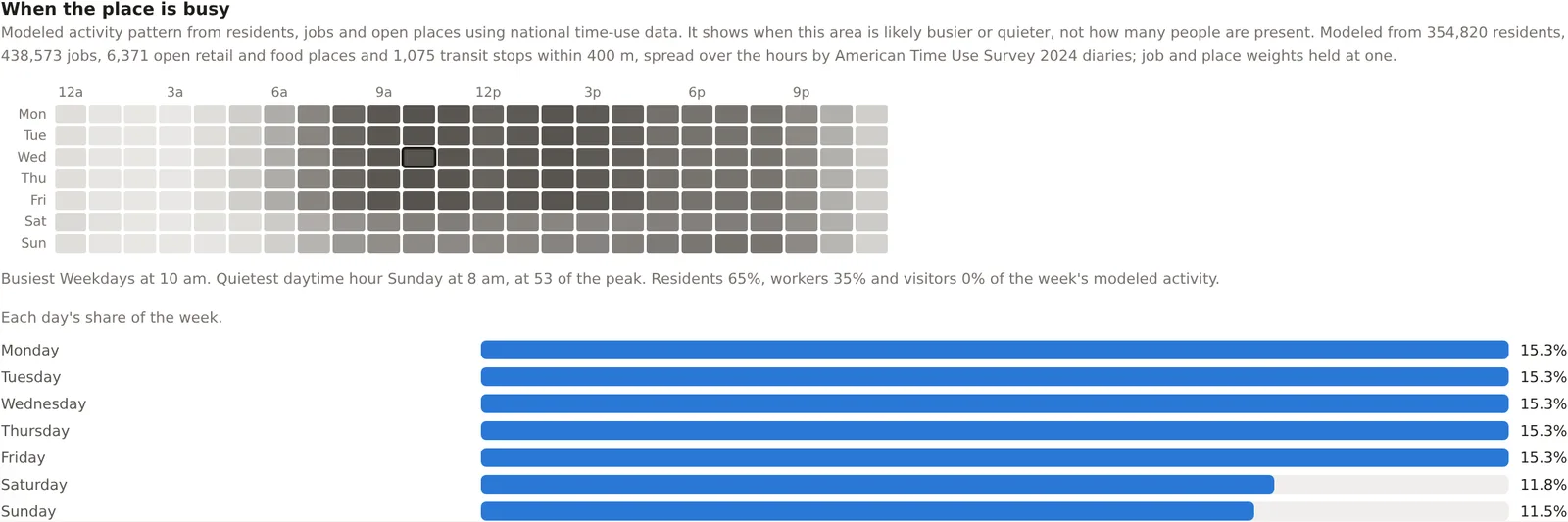
Beside the road, a second pattern models when the area itself is likely busier or quieter. It is built from the residents, jobs and open retail and food places inside the area and the hours the American Time Use Survey records for being at home, at work and out, so a residential area peaks in the evening while an office district peaks before lunch. The pattern is a shape rather than a count of people present, and the caption beside it says so. The activity week is included on Pro and Team.
Transit access
See how residents reach the area without a car
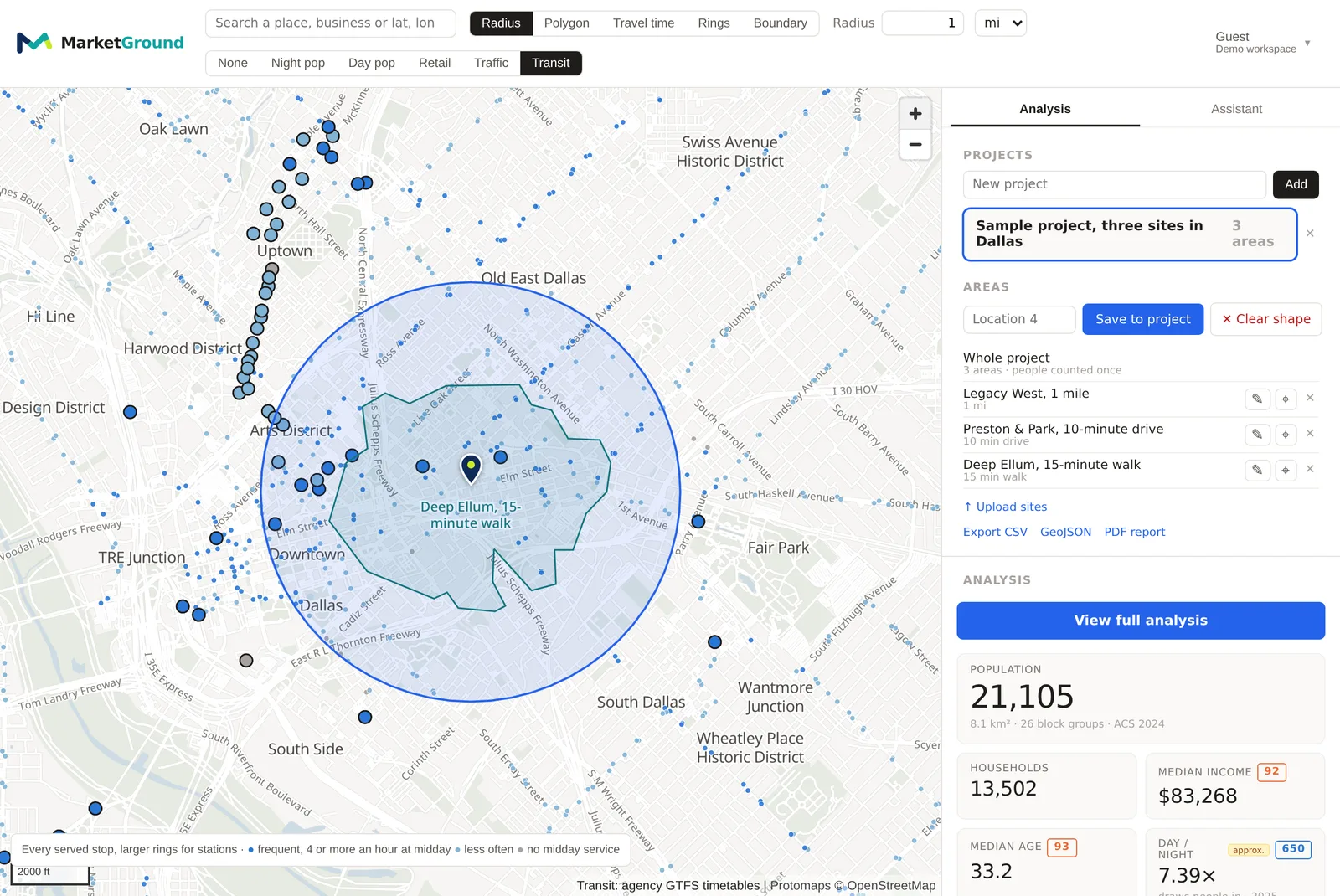
Every area counts the transit stops and stations inside it by mode, from rail and subway stations to light rail and bus stops, and reports the share of residents living within 400 meters of any stop and within 400 meters of a frequent one, where frequent means four or more departures an hour at midday on a weekday. The timetables come from the agencies themselves, and an area with no current timetable reads as a gap in coverage rather than as zero. Turn on the Transit layer to see the stops on the map. Included on Pro and Team.

The Retail layer
See every listed business on the map
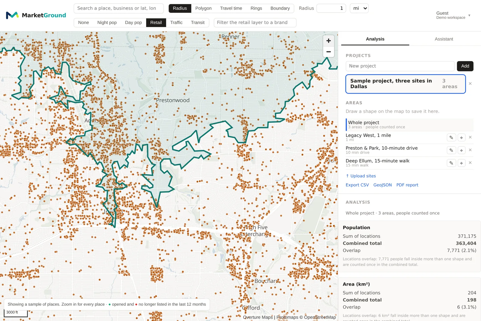
Turn on the Retail layer and every open place in the listings is drawn as a neutral gray dot from zoom 10, the zoom the map opens at. Where a tile holds thousands of places the map draws a sample until zoom 14 and says so, and from zoom 14 it draws every one. Places that appeared in the last twelve months are green and places no longer listed are red, so a corridor filling in or emptying out is visible before you draw an area. Filter the layer to one brand to see every location of a chain. Business listings are on every plan, and the opening and no-longer-listed colors are included on Pro and Team.
Businesses and places
Review nearby businesses
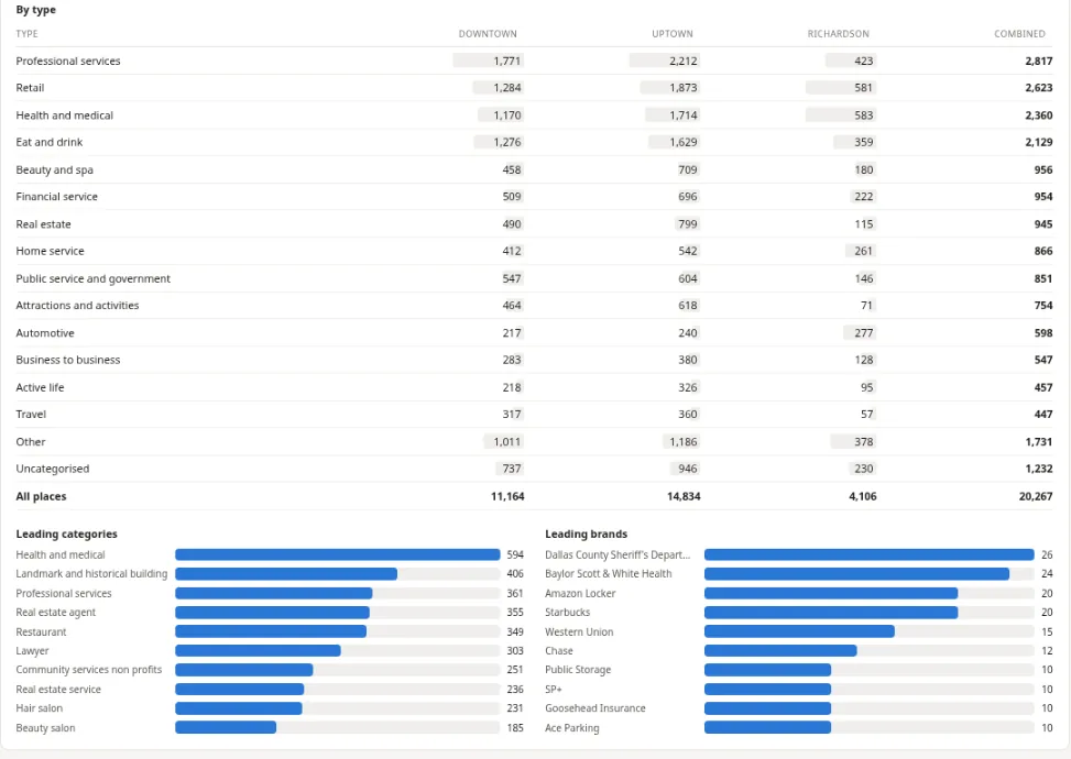
Compare listed businesses by category and brand for each saved area and the combined project. Overlapping areas include each listed place once in the combined total. Use the detailed categories to review direct competitors and other nearby businesses, and the brand list to see which chains are already present. Listings come from Overture Maps and refresh every month. Included on every plan.
Business change
See what opened and what is no longer listed
Every monthly release of the business listings is kept and compared with the ones before it, so an area can show what has appeared and what has dropped out over the past three, six or twelve months, broken down by type, with the current stock, the net change and a monthly series. A place counts as no longer listed only after it is absent from two consecutive releases, so a single missed month is treated as noise, and it is reported as no longer listed rather than closed, because a listing ending is not the same as a business closing. The same figures for the metro area sit alongside, so a trade area losing food places while its metro gains them is easy to see. Openings and closures can also be drawn on the map. Included on Pro and Team.
County momentum
Read whether the counties around the area are growing
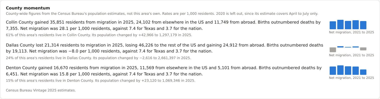
Each county holding at least a tenth of the area's residents gets a line from the Census Bureau's annual population estimates, up to three, largest first. The line gives the county's net migration in the newest full year, split into moves from elsewhere in the United States and from abroad, births against deaths, and net migration per 1,000 residents beside the same rate for the state and the nation. The figures describe the whole county and never the area itself, because the Bureau publishes nothing smaller, and the card says so. Read the conventions on the methodology page. Included on Pro and Team.
Keep reading
The features beside these
Every feature is listed by plan on the features page, and how each figure is built is on the methodology page.