Features
Tools for analyzing and comparing locations
Define an area, learn who is there by night and by day, read the traffic, transit and businesses around it, count the competition, and carry the sites through a screen, a stress test and a report. Each part has its own page below.
Define the area
Choose an area to analyze
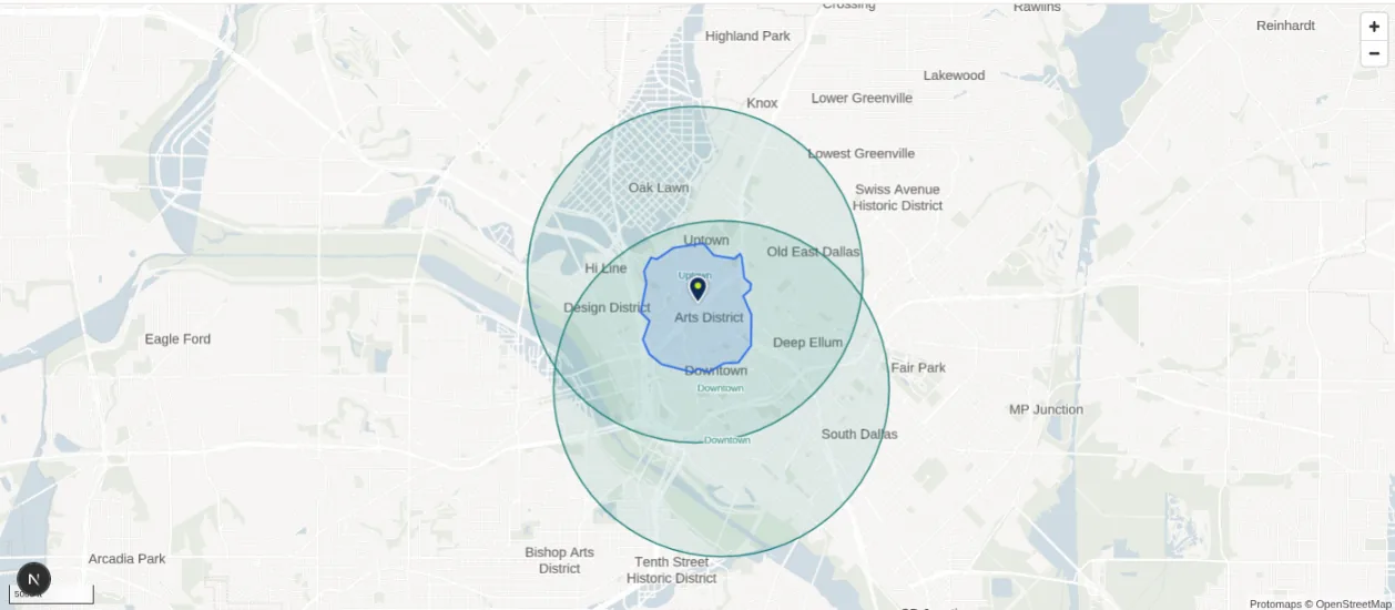
Draw a radius around a point, trace a custom boundary or choose a travel time by car, on foot, by bicycle or by public transit. Analyze rings around one site, a ZIP, city, county, metro or tract as itself, or upload the sites you already have. The example shows a 15-minute walking area around Klyde Warren Park, with a previously saved area to the east. Every way to define an area
Day and night population
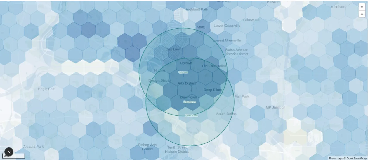
Compare population by day and night
Each area includes resident and daytime population measures. Their ratio shows whether the estimated daytime population is larger or smaller than the resident population. Turn on the population layer to explore patterns across a city before selecting an area. Included on every plan. Who is there, in depth
Benchmarks and index scores
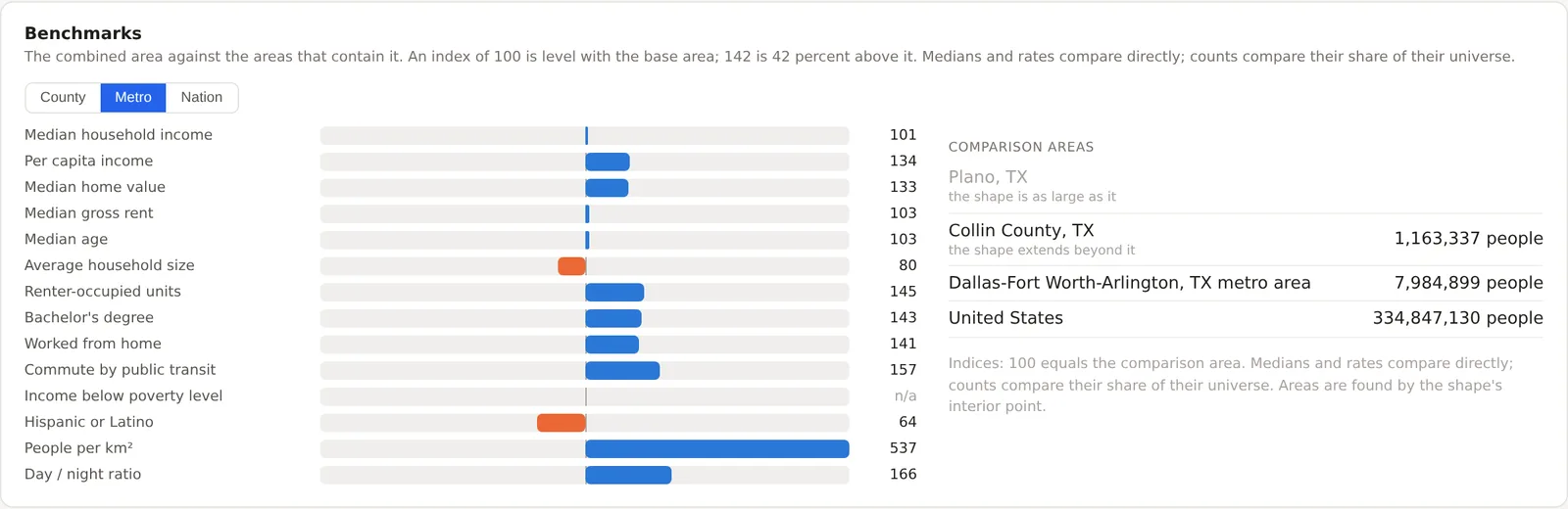
Put local figures in context
Compare an area with its city, county, metro area or the nation. An index of 100 matches the comparison area. For example, a renter index of 145 means the share of rented homes is 45 percent higher. Switch between benchmarks to see how the area relates to different regions. Included on Pro and Team.
Competition and market share
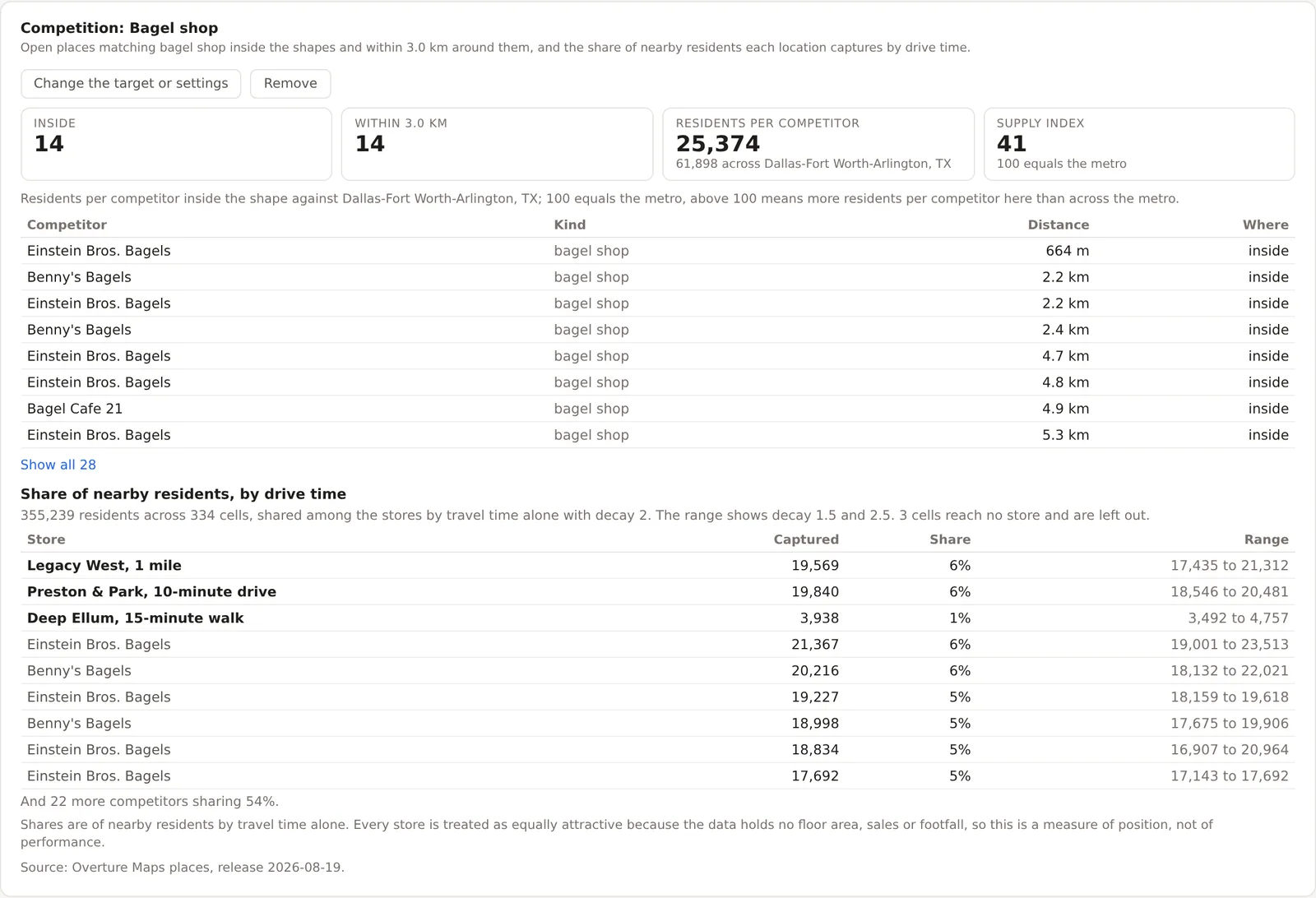
Count the competitors and estimate the share they leave
Choose the kind of business you compete with and MarketGround counts the open places inside the area and around it, indexes the residents per competitor against the metro, and estimates each store's share of nearby residents by travel time alone. The same model shows where your own sites take from each other, and a co-tenancy profile says how well a site matches the neighbors a brand usually has. Included on Pro and Team. Competition, in depth
Site criteria screener
Score every site against the client's sheet
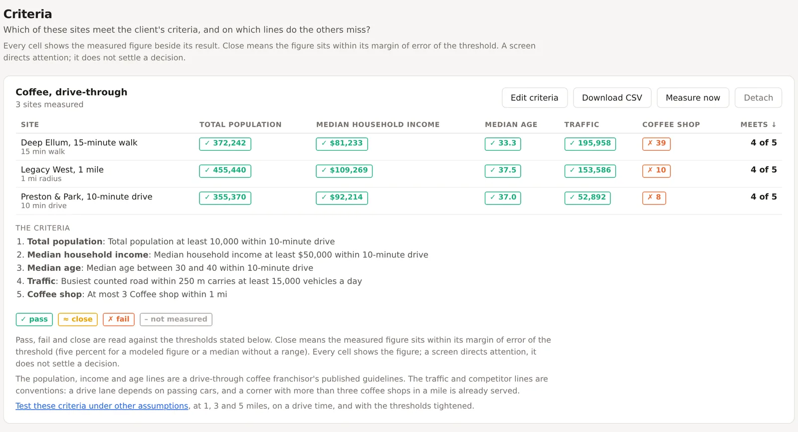
Enter the thresholds a tenant rep carries, such as population within three miles above 50,000 or at most two competitors within two miles, and every saved site is judged on each line, with the figure beside the result. Close means within the margin of error. Start from a template for coffee, quick service, salons, fitness, childcare, urgent care or pet, then test the ranking under other rings and drive times, forecast a candidate's sales from your own stores' figures, and record the decision. Included on Pro and Team. Deciding and delivering, in depth
Shareable reports
Send a report to a client who has no account
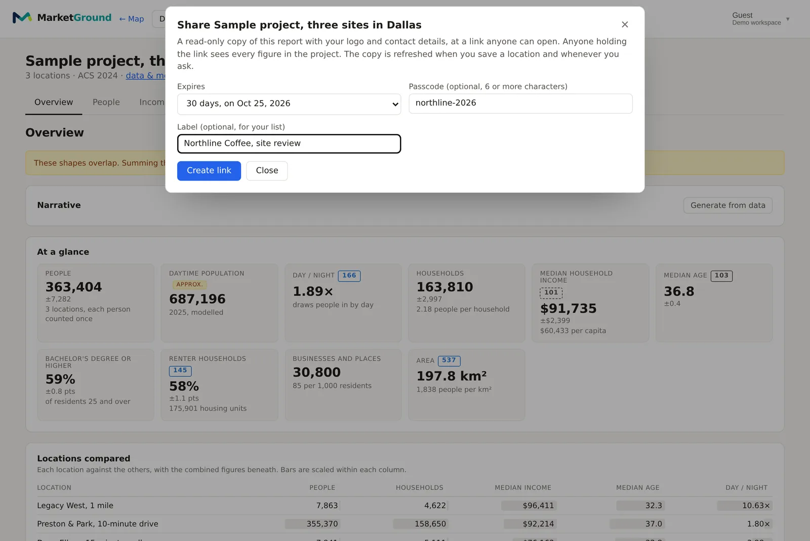
Create a read-only link to a project report carrying your logo and contact details, and send it to anyone. Choose whether it lasts a week, a month, a quarter or a year, add a passcode that you pass on separately, and label the link so you know later who received it. The shared copy refreshes when you save a location and you can revoke it at any time, or download the same report as a PDF. Share links are included on Pro and Team.
Every feature
Read about each part in depth
Draw a radius, a polygon or a travel time, analyze rings and named boundaries, or upload the sites you already have.
Day and night population, jobs by industry, combined demographic tables, population history, benchmarks and margins of error.
Traffic counts through the week, when the area is busy, transit access, the Retail map layer, businesses by category and brand, openings and county momentum.
Competitors and supply, a market share estimate by travel time, cannibalization across your sites, co-tenancy profiles and chain footprints.
Fit a model to your own stores' sales and score any candidate corner in your own currency, with a range, the drivers and the error shown.
Projects, the criteria screener, the stress test, a sales forecast from your own figures, decision history, an assistant that acts, the PDF report and shareable links.
What is included
Every feature, by plan.
| Feature | Free | Pro | Team |
|---|---|---|---|
| Seats | 1 | 1 | 5 or more |
| Projects | 1 | Unlimited | Unlimited |
| Saved areas you draw | 4 | Unlimited | Unlimited |
| Radius and polygon areas | Yes | Yes | Yes |
| Travel-time areas | No | Up to 60 minutes | No cap |
| Ringed areas (1, 3 and 5 miles) | No | Yes | Yes |
| ZIPs, cities, counties and metros as areas | No | Yes | Yes |
| Jobs by industry (LEHD LODES) | No | Yes | Yes |
| Benchmarks and index scores | No | Yes | Yes |
| What opened and what is no longer listed nearby | No | Yes | Yes |
| Traffic counts on the roads around an area | No | Yes | Yes |
| Traffic through the week, hour by hour | No | Yes | Yes |
| Shareable read-only report links | No | Yes | Yes |
| Site criteria screener with starter templates | No | Yes | Yes |
| Site comparison stress test | No | Yes | Yes |
| Decision history with outcomes and export | No | Yes | Yes |
| Sales forecast fitted to your own store figures | No | Yes | Yes |
| Lookalike search across a metro, explained variable by variable | No | Yes | Yes |
| Report narrative drafted from the figures and checked against them | No | Yes | Yes |
| Competitors, market supply and a market share estimate by travel time | No | Yes | Yes |
| Co-tenancy match against the neighbors a brand usually has | No | Yes | Yes |
| Transit access around an area | No | Yes | Yes |
| County momentum from Census estimates and IRS migration | No | Yes | Yes |
| Economy indexes against the nation, metro and county | No | Yes | Yes |
| Pins with notes for competitors and places of interest | No | Yes | Yes |
| Drive times with typical traffic | No | 300 a month | 1,500 a month |
| Upload sites from files | No | 1,000 areas a day | 1,000 areas a day |
| Demographic variables | Core set (33) | All (134) | All (134) |
| Age by sex and other combined tables | No | Yes | Yes |
| Day and night population | Yes | Yes | Yes |
| Population history to 2016 | Yes | Yes | Yes |
| Businesses and places | Yes | Yes | Yes |
| CSV and GeoJSON export | No | Yes | Yes |
| PDF report with your logo and contact block | No | Yes | Yes |
| Map image of every area in a project (PNG) | With MarketGround branding | With your branding | With your branding |
| Assistant questions | 10 a month | 300 a month | 300 per seat a month |
| Assistant deep analysis | No | No | Yes |
Prices and the full plan comparison are on the pricing page.
And the rest
Small things that turn out to matter.
Analyze anywhere in the country
Population, demographics and business listings cover all fifty states and the District of Columbia, and travel-time areas are computed on the national road network.
Take the numbers with you
Export any project as CSV for the spreadsheet or GeoJSON for your own maps, with every variable and every shape included.
Work as a team
Invite colleagues into your organization. Projects are shared, roles are simple, and nobody outside your organization can see a thing.
Honest about uncertainty
Survey-based figures carry margins of error, and a few are approximations. Wherever that is true, a small badge next to the number says so.
Fresh data, on a schedule
Business listings refresh every month, demographics arrive with each Census release, and the population surface is anchored to the newest county estimates every year.
Every method written down
How each figure is built, and how it is checked before it is served, is on the methodology page. Read it before you trust us.
Try it on a place you already know.
The free plan is enough to draw a few areas and see whether the numbers match your instincts. Most people find out something they did not know.